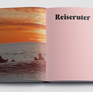
You choose a font, set a font size, align the text, and you’re done, right?
- Baris Sehri
- 6d
- 3 min read

Why Good Typesetting Looks Easy, but It’s Way Far from It.


To most people, typesetting looks deceptively simple. You choose a font, set a font size, align the text, and you’re done, right? In reality, professional typesetting is a highly technical craft that sits at the intersection of design, linguistics, mathematics, and print production. A good typesetter shapes how a reader experiences text, making your content clear, easy to read, visually appealing, and professional. An amateur, on the other hand, can unintentionally make it confusing, tiring, or awkward to follow.
This is why typesetting is one of those disciplines where you don’t know what you don’t know, and why experience matters so deeply.
What Is Typesetting, Really?
Typesetting is the art and science of arranging text so that it is:
Readable·
Comfortable to read for long periods·
Structurally clear·
Visually harmonious·
Technically correct for its medium (print or digital)
A professional typesetter doesn’t just place letters on a page. They orchestrate spacing, rhythm, hierarchy, and flow to optimise the reading experience.
What Makes Someone a Good Professional Typesetter?
1. Deep Understanding of Typography (Not Just Fonts)
A professional typesetter understands:
Typeface anatomy (x-height, ascenders, descenders, counters)·
Differences between serif, sans-serif, display, and text faces·
Why certain fonts work better for different types of text·
Historical and cultural context of typefaces
An amateur might choose a font because it “looks nice.” A professional chooses it because it behaves well for the specific type of text.
2. Mastery of Spacing (The Invisible Backbone)
Spacing is one of the most technically demanding aspects of typesetting, and one of the easiest places to spot the difference between amateur and professional work. A trained typesetter carefully controls:
Kerning (space between specific letter pairs)·
Tracking (overall letter spacing)·
Word spacing· Line spacing (leading)
Even the smallest spacing mistakes can make text feel cramped, uneven, or tiring to read. Professionals avoid this not by intuition alone, but by following established typographic rules and applying years of training and experience
3. Control of Line Length and Reading Rhythm
Another technical aspect of typesetting is managing measure (line length).
Professionals know:
Ideal characters per line·
How line length affects reading speed and comprehension·
How to adjust margins, font size, and leading together
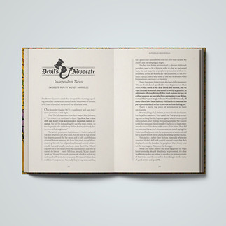
4. Understanding Text Hierarchy and Structure
Typesetting is not decoration. It’s information architecture.
A professional typesetter:
Creates clear distinction between headings, subheadings, body text, captions, footnotes·
Maintains consistent hierarchy across an entire document·
Uses typographic contrast (size, weight, spacing) rather than random styling


The Rules Typesetters Follow (Yes, There Are Many)
Typesetting demands great precision and it is governed by a large set of rules, conventions, and best practices. These rules didn’t come out of nowhere, they’re shaped by centuries of printing experience and by research on how people read. Studies on readability, eye movement, and line length (dating back to early typographers and later researchers like Emil Ruder and Jan Tschichold) showed how spacing, margins, and type choices affect comfort and comprehension. Over time, these findings became practical rules that help text feel clear, balanced, and easy to read.
Why Amateurs Don’t Understand Typesetting Fully
1. The Problems Are Subtle
Bad typesetting rarely screams. It whispers.
Readers may feel:
Tired faster·
Slightly annoyed·
Less focused·
Uncertain where to look
2. Software Makes It Look Easy (But Isn’t)
Modern software allows anyone to:
Pick fonts·
Adjust spacing·
Export PDFs
But knowing what values to use and why is the hard part. Software doesn’t teach judgment or understanding, it only provides tools.
Professionals understand when to break rules and when rules are non-negotiable.
3. Typesetting Is Learned Through Repetition and Failure
You can’t truly learn or understand typesetting from presets or tutorials alone. The skill develops over time through professional training and hands-on practice, in the right context and with proper mentoring.
The Ultimate Goal of Professional Typesetting
Ironically, the best typesetting goes unnoticed.
When done well:
The reader forgets the page·
The eye flows effortlessly·
The text feels calm, confident, and trustworthy
When done poorly:
The design draws attention to itself·
The reader works harder than they should·
The content suffers
This is why typesetting is both an art and a discipline, and why professionalism matters.
Typesetting is not about making text look pretty.
It’s about respecting the reader.
A professional typesetter understands that every spacing decision, every line break, every margin exists to serve clarity, comfort, and meaning. And that level of understanding takes time, technical knowledge, and a trained eye, things no preset or shortcut can replace.


Comments